
Eastern Shore, Maryland
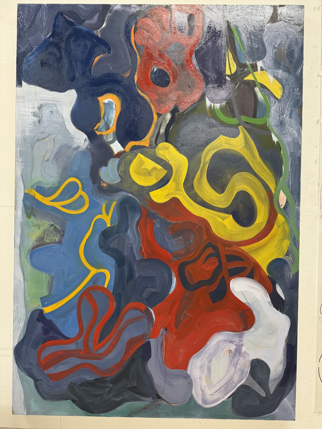
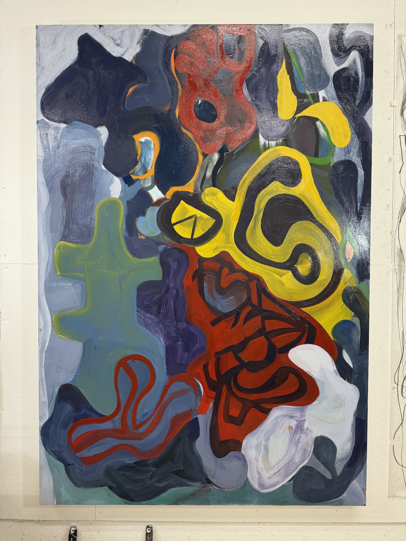
McKinleyville is the first painting that I have completed since moving here there years ago. McKinleyville is the name of the street that I live on, but it also embodies this place, rural, somewhat isolated, saturated with light and color. The painting began very differently than it appears in this photograph, just a play of lines drawn on the surface in a jumble of confusion (1). I like the confusion and trying to sort out what’s what. There was a game show on television when I was a child called Concentration, where players tried to figure out objects in a tangle of lines. I was immediately drawn to that as a child, and I still like doing it, figuring out visual puzzles. I am a visual person.
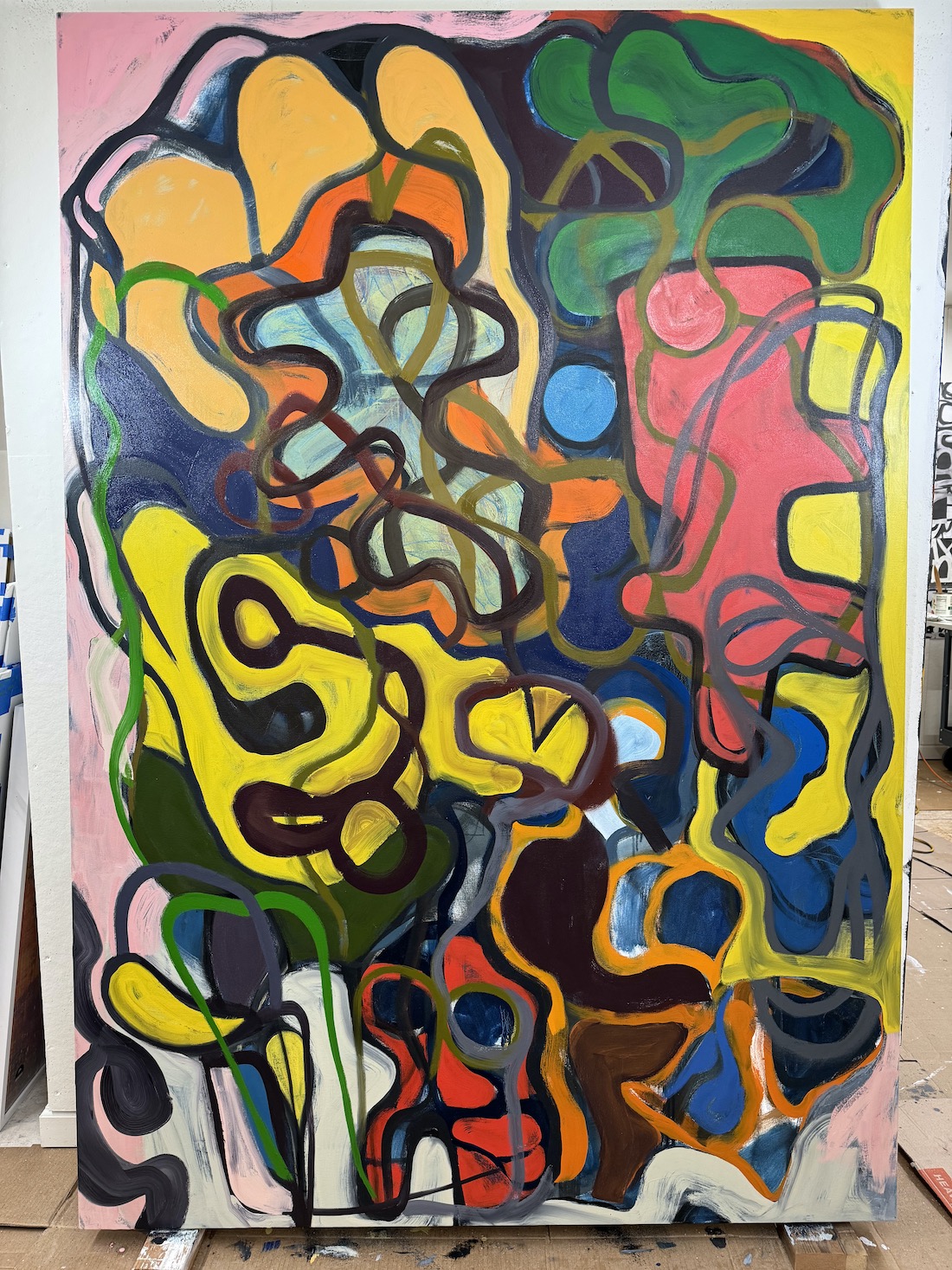
As the painting proceeded, forms began to emerge, and the relationship between these forms and the ground, what’s called “figure/ground,” became more complex (2). There was no plan that I was following, nor any sketches for the imagery. Instead, the images as I began to define them, were products of imagination devised on the spot and within the context of the painting, without forethought.
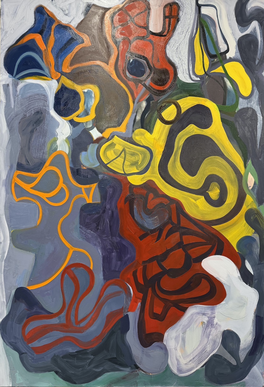
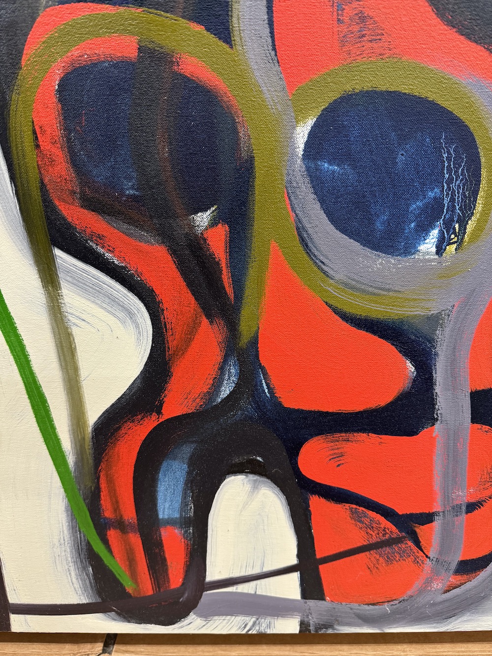
I must have wanted “things,” shapes with clarity because I introduced white into the painting (3), which quickly turned gray in the wet paint, and tried to pull out those shapes that interested me. Some of these were beginning to be evident at the beginning: a cartoonish head with a hat, a skull-like shape with large eyes and no teeth, and plant stems and flower forms that emerged along the edge of the painting (3, 4).
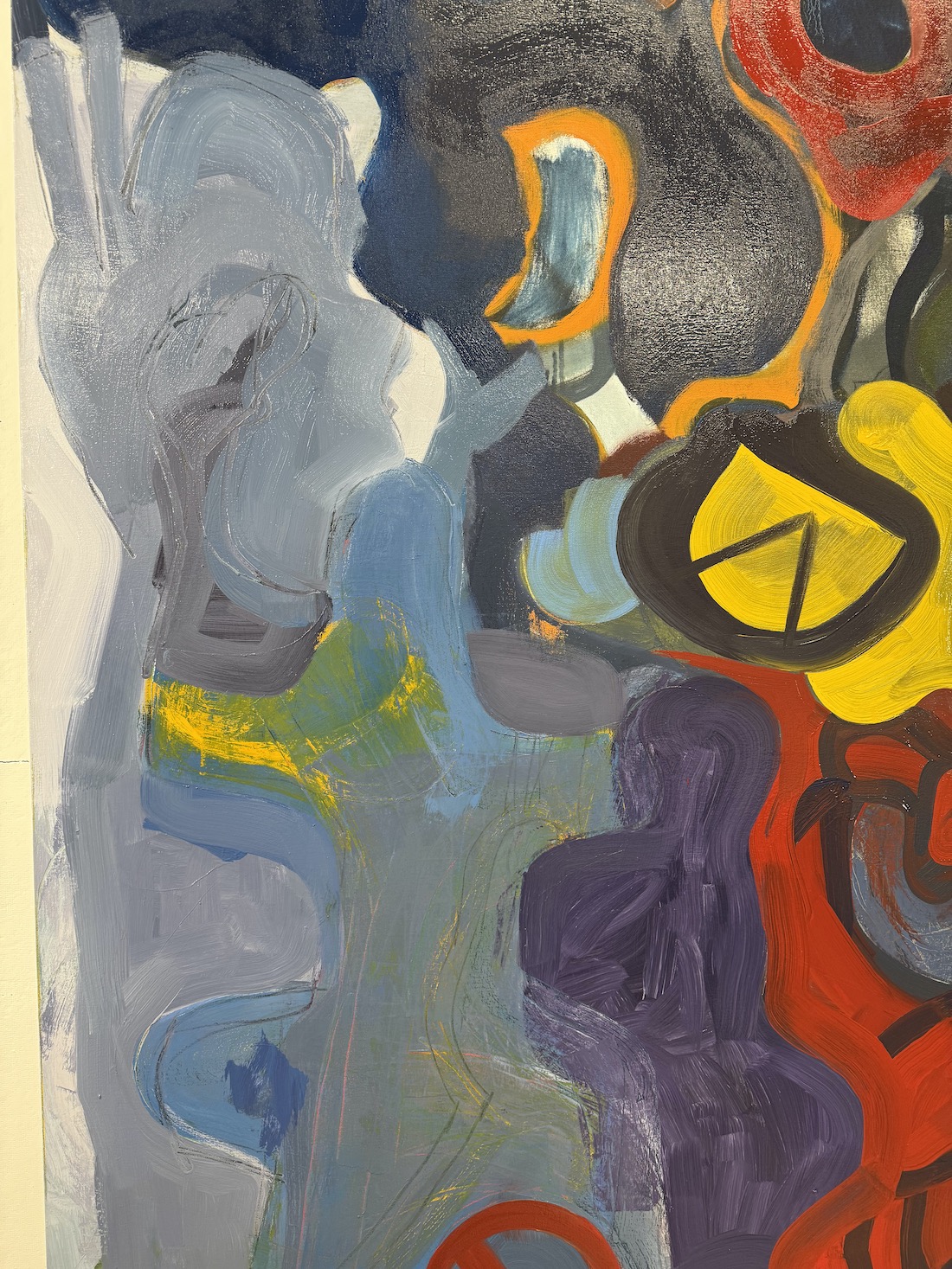
More forms began to be clarified. The head with the hat just above the center receives a thick outline of orange/red (5), the gray shapes around it filled in with yellow, blue, and green (5, 6). the jumbled lines that flow through the space start to be colored making them another subject in the painting. These ribbons of color converge on the disembodied head (7), crossing over each other like highways on a map.
Once shapes had appeared, I kind of embraced them by adding color (8) both to the object and the overlapping lines (9). After a few weeks of painting, I stopped and set the painting aside. The color by then had brightened considerably and I felt it was getting away from me (10), though when I look at it now, I like the glaring, “in your face” color. Still, that’s not how I felt at time. The painting sat for eight months, before I picked it up again.
Then my friend, Jeffrey, came for a short visit. Jeffrey’s a painter who lives in Brooklyn, having moved there shortly after receiving an MFA from Cranbrook Academy of Arts. He has an eye for color. He may have said something about the color in my painting being garish, I don’t remember. But he did suggest using a chromatic gray instead of black to outline the painting’s forms. “What about drawing,” he said, “it’s one of your strengths.”
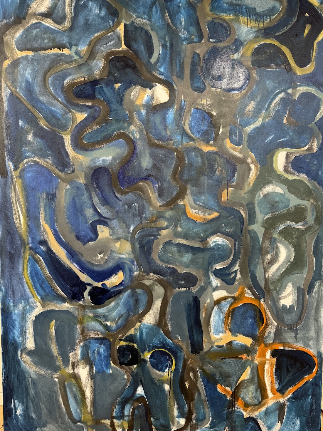
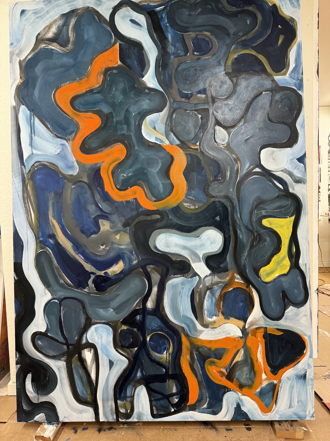
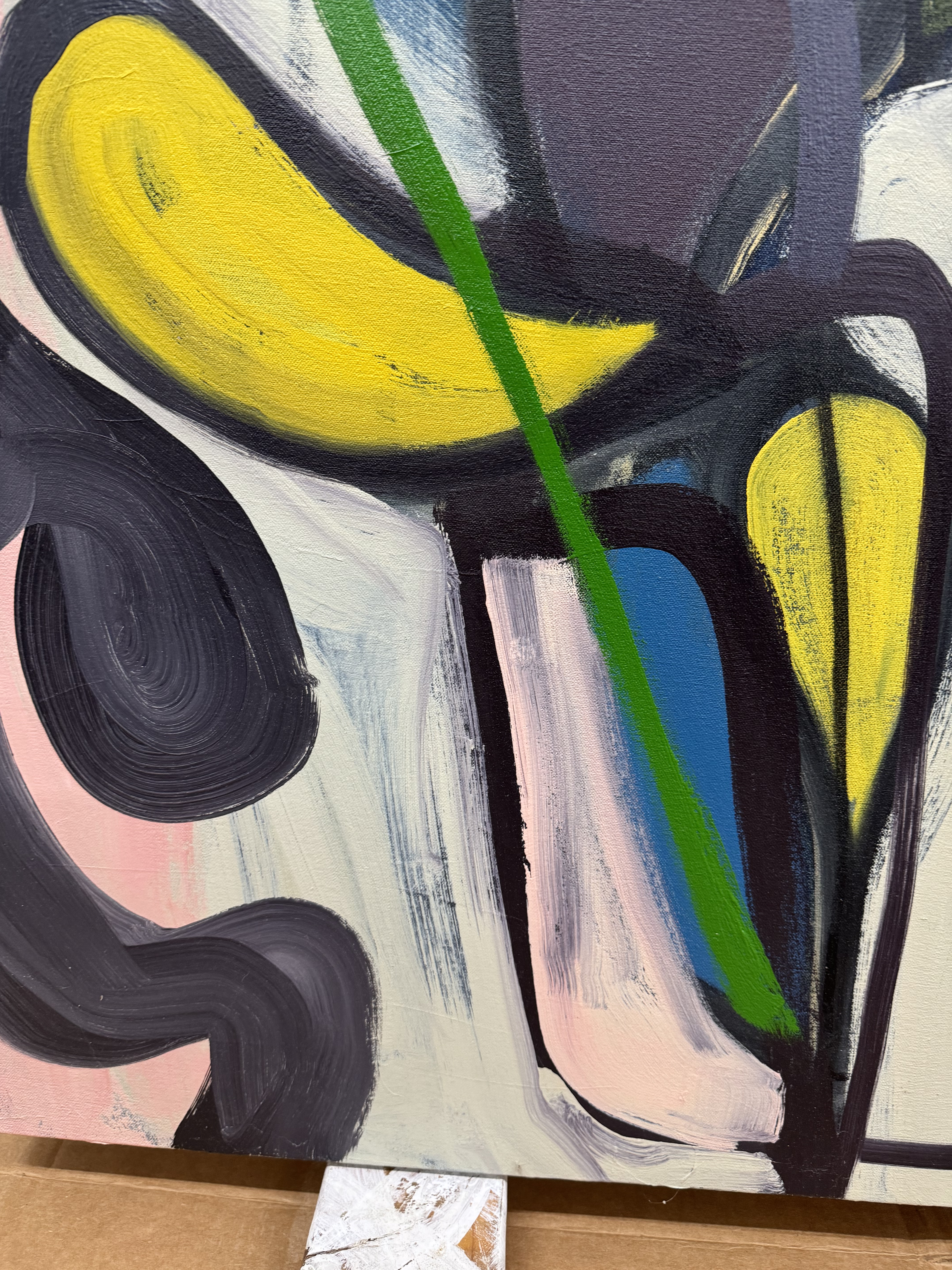
I thought of a way of drawing the major shapes of the painting by taping sheets of tracing paper to the surface. With charcoal, I traced the outlines of the shapes and this act drew me back (no pun intended) into the painting (11). Jeffrey made up a list of the different ways he could think of to make chromatic grays and these mixtures found their way in to the painting (12), transforming the shapes in the lower half of the work.
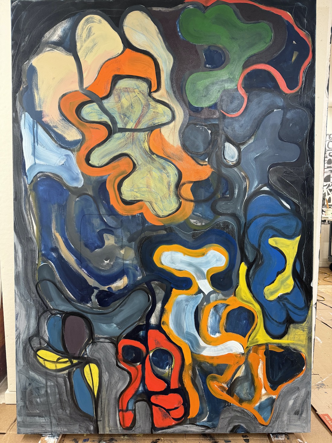
The introduction of subtle grays in to the painting kind of reduced my dependency on bright color while transforming what had been flat shapes into forms with contours resembling actual forms, living forms (13-16). With these revisions my painting became more about uncertainty and vulnerability, losing some assurance along the way. At the same time, the overall image shifted from a focus on external appearance to something to be submitted to and felt.
This is a transitional painting, neither abstract or figurative. Somewhere during its making, shapes transformed from flat to volumetric, acquiring weight and substance. Lines painted across forms echoed the curving edges suggesting volume. Shapes situated themselves in the picture plane. One of the first shapes to emerge was a skull image. Where did it come from and how did it get there? Answer that, and you can answer the mystery of painting.


Leave a comment